Nothing is for sale here. Freewill tips keep the site running. Want to help? → Tip via Paypal
Designing with Breathing Room: The Importance of White Space
A dive into a not-so-empty topic of white space on web pages—the unsung hero of web design. Some may think it a boring topic, but white space is an important design asset that can make or break your best efforts. So, buckle up and take a lighthearted romp through the importance of white space and how it can make your site shine like a over-sized disco ball!
Enhancing Visual Appeal
Picture this: you walk into a room with stuff crammed into every nook and cranny. You look around at the chaos and just want to leave. Well, the same goes for web pages. If there's too much going on, too much clutter, people just want to leave, and will.
White space brings some much-needed order and balance to the layout. It's like giving your content breathing room. By using white space strategically you create a clean and classy vibe that says, "You are welcome here!"
You may not be a professional web designer, but you don't have to advertise it.

Improving Readability and Comprehension
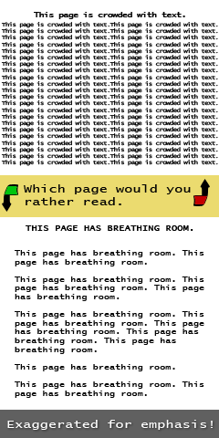 Nobody likes reading a wall of text. It's like trying to find a grain of salt in a bowl of sugar. White space to the rescue! A strategic use of white space makes it easier for users to enjoy your content. Think of it as giving weary eyes a vacation from the stress of textual overload—it's a peaceful pause for their peepers!
White space acts as a visual rest that separates different sections, paragraphs, and individual elements, making the content easier to digest. Adequate spacing between lines of text, known as leading, enhances legibility and prevents the text from appearing cramped or overwhelming.
Embrace the Scanners
Let's face it, most of us skim web pages. We only slow down to read every word once we home in on what interests us. We have become master scanners! But without white space it's like being lost in a maze without a map. Nobody wants that. White space acts as a mental oasis in a storm of information clutter.
White space helps organize content and guides users through the hierarchy of information. By creating distinct sections with adequate spacing, users are able to quickly identify the main points, skim the content, and locate desired information efficiently.
Focus Attention Where You Want
Attention is a precious commodity on the web. A smart use of white space can be your secret weapon to capture attention and keep those hungry eyes from drowning in the disheartening sea of visual overload. Keep those eyeballs glued to the important stuff—your content—instead.
Creating visual breathing space around key elements quietly ushers in a sense of sophistication and class. It lets you direct users' attention to specific elements, such as a call-to-action, important messages, or featured products. White space acts as a silent visual that isolates and highlights these crucial elements, drawing attention and increasing engagement.
How to Use White Space Effectively
Using white space effectively on a web page is crucial for improving readability, visual appeal, and an enhanced user experience. Here are some best practices for utilizing white space effectively.- Prioritize content:
- Use white space to prioritize important elements and allow them to breathe. Surround key content, such as headlines, important images, or call-to-action buttons, with ample white space to draw attention to them. White space actually draws attention to the content it surrounds!
- Increase legibility:
- Ensure that there is enough white space between paragraphs, lines of text, and sections to enhance readability. Avoid cluttered layouts that make it difficult for users to distinguish one element from another.
- Emphasize visual hierarchy:
- White space can be used to establish a visual hierarchy by creating varying levels of spacing between different elements. Increase the space around major headings or sections to make them stand out, while maintaining normal spacing around less important elements.
- Group related elements:
- Use white space to group related elements together. By placing related content closer to each other and using appropriate spacing around the group, you can create a visual connection to help users understand the relationship between the elements.
- Simplify overall design:
- Avoid overcrowding the page with too many elements or excessive content. Embrace minimalism and leverage white space to give the design a clean and uncluttered appearance. Remember, less is often more.
- Allow for responsive design:
- White space becomes even more important in responsive web design, where layouts adapt to different screen sizes. Ample spacing ensures that content remains legible and accessible across various devices. Adequate white space helps prevent accidental clicks and ensures a smooth mobile browsing experience.
- Consider line length:
- Use white space effectively in the margins or surrounding text blocks to control line length. Long lines of text can be challenging to read, so adding white space can make the content more digestible and visually appealing.
- Separating content:
- Use white space to separate different types of content, such as articles, sidebars, or related sections. Clearly define the boundaries between elements to prevent confusion and enhance readability.
- Interactive elements:
- Give interactive elements, such as buttons or clickable areas, enough breathing room. Sufficient white space around these elements reduces the risk of misclicks and improves the overall usability of the page.