Nothing is for sale here. Freewill tips keep the site running. Want to help? → Tip via Paypal
CSS Photo | Picture Frames
This tutorial demonstrates how to create multi-color borders around photos without using any images. See the example below.

The photo of the lemurs is the only image. All the black, white and blueish green colors that make up the picture frame are all added with CSS.
It's quite simple to do. The technique simply stacks multiple box shadows on top of each other.
This technique works in most, if not all, the major browsers. Browsers that don't support the box shadow property will simply display the picture without the border, so it's safe to use.
As you can see in the above example, the "shadows" vary in color and width. I also didn't blur any of the shadows, which is what gives it the hard-edged lines.
You can also add a typical drop shadow to the whole thing to give it depth. I'll show you that shortly, but first, here’s the CSS for that example as it would be coded in an external style sheet:
.frame-demo1
   {box-shadow:
    0 0 0 1px #000,
    0 0 0 3px #6FD2C4,
    0 0 0 4px #000,
    0 0 0 9px #288274,
    0 0 0 10px #fff,
    0 0 0 18px #1C5B52,
    0 0 0 19px #000;}
Each line of code from line 3 through line 9 represents one of the lines in the border. Line 3 is the inner-most box shadow, in this example, it’s a black line one pixel thick.
Line 4 is the second color in the border, as measured from the inside toward the outside. In this example it’s a light greenish-blue (almost turquoise) color. Each line then, works its way from the inside to the outside, so the last line of code represents the outermost line in the border.
Notice how each line is coded to be wider than the line before it. The first (innermost) border line is 1 pixel wide, the second line is 3 pixels, the third is 4 pixels and so forth. Each line has to be larger than the one before it or the one before it will cover it up.
It may not appear to be wider visually, that depends on how much is left uncovered, but each line (box shadow) is measured from the edge of the element it borders.
You can use this technique on any element that allows a border, it doesn’t have to be a photo. So, divisions, heading tags and other elements can have a border like this as well.
Look at the first two lines of code. If they were both 3 pixels, the first black line would cover the second light greenish-blue line so you wouldn’t see the greenish-blue line at all.
That’s all there is to it. You can add as many lines of box shadow code to the mix as you like, just remember to separate them with a comma. Of course, you can change the widths and colors as well.
As I previously mentioned, you can also use the last entry as a real drop shadow, as shown below. To do that, you need to change the horizontal and vertical offsets and the blur.
Here's the example of that same picture with a traditional drop shadow added to give it depth. It’s the exact same code as before, except I’ve added one more line of box shadow code. Here’s the line I added to the end:
First notice that in the original box shadow lines of code, the first three values were all zero (0). With zero for a value no unit of measurement is needed. With the line of code I added for the drop shadow effect, the values are no longer zero so a unit of measurement is needed. I used pixels (px).
 If you add the new line for a drop shadow effect to the end of the box shadow code, remember to use a comma to separate it from the one before it.
Now let's break that last line of code down so you understand what each part of it means. In fact, I'll put it in a graphic that you can download so you'll always have a handy reference.
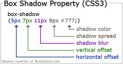 This graphic sums up what each part of the code represents, but you might wonder what the “spread” is exactly. Think of it as growth without the blur. Let me explain that…
The box shadows in the first example was 19 pixels at its widest point. If you add a drop shadow and only offset it by 5 pixels horizontally and 7 pixels vertically, as I show in the graphic, but don’t include any spread, you won’t see the drop shadow because it will be under the layer above it. The 5 and 7 pixel offsets aren’t enough to bring the shadow past the 19 pixel border part, so I added a spread value to bring the shadow into view.
You could bring the shadow out past the edge of the borders by using a larger shadow offset, or by increasing the blur more (which will lighten the shadow color), or by using the spread. Several different shadow looks can be achieved by playing with these values.
OK, so that wraps up this tutorial. I’ll close it out by providing four more examples to spark your imagination.

{box-shadow:
0 0 0 1px #000,
0 0 0 3px #D3C48D,
0 0 0 4px #fff,
0 0 0 14px #BB8951,
0 0 0 15px #D3C48D,
0 0 0 17px #000,
7px 7px 7px 15px #999;}

{box-shadow:
0 0 0 2px #000,
0 0 0 9px #6B30E7,
0 0 0 15px #A480F0,
0 0 0 16px #fff,
0 0 0 17px #D2C0F8,
0 0 0 18px #000,
7px 7px 7px 15px #999;}
{box-shadow:
0 0 0 1px #B3CFAD,
0 0 0 11px #427531,
0 0 0 15px #6FB856,
0 0 0 16px #fff,
0 0 0 19px #765850,
0 0 0 21px #000,
9px 9px 12px 17px #bbb;}
Notice the light blue color in the frame below. See the shadow stretching over it from the inside toward the ouside? You can blur shadows inside the frame too, and give it more of a 3D look. I hope that sparked your imagination.
{box-shadow:
0 0 0 2px #000,
0 0 7px 2px #000,
0 0 0 12px #86A6BF,
0 0 0 13px #0D4868,
0 0 0 17px #188BC9,
0 0 0 18px #000,
8px 8px 10px 10px #494949;