Nothing is for sale here. Freewill tips keep the site running. Want to help? → Tip via Paypal
Image Transitions
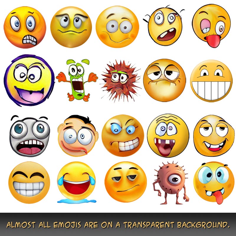
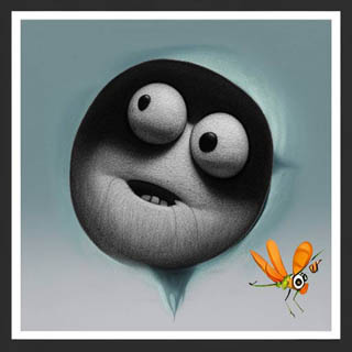
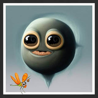
This tutorial shows you how to have one image fade into another image when your cursor is placed on it. Try it below to see one funny face fade into another, and a bug travel from one side of the image to the other.
Pretty nifty, eh Swifty!
The only drawback I have had time to solve is making it all responsive, so the images have to be on the small site to keep the page responsive.
This is done by placing one image on top of another, and then making the top image transparent when the cursor is placed on it, thus revealing the image below.
For the smoothest transition, it works best if the two images are the same size.
I set the transition from one image to the other for two seconds, but you can adjust that to your preferences in the CSS portion of the code.
Here is that CSS code, which preferably, would be in your external style sheet:
#fade
  {position: relative;
  width: 200px;
  height: 200px;
  float: left;
  margin-right: 20px;
  margin-bottom: 10px;}

#fade img
  {position: absolute;
  left: 0;
  -webkit-transition: opacity 2s ease-in-out;
  -moz-transition: opacity 2s ease-in-out;
  -o-transition: opacity 2s ease-in-out;
  transition: opacity 2s ease-in-out;}

#fade img.top:hover
  {opacity: 0;}
The first chunk of code creates an ID named fade, positions the image relative to where it is in the code, sets the image width and height, floats it to the left so text can flow around the image, and places a margin on the right side and bottom so the text doesn’t butt up against the image.
The second chunk of code uses absolute positioning so the second image is placed on top of the first one. Lines 12-15 set up the fade from one image to the other. Line 15 is the official CSS standard, while the other three lines offer support for older browsers.
The "2s" in lines 11-14 is for a “2 second” transition duration. Change that to make it longer or shorter. You can even use fractions of a second if you express it as a decimal number. For example, "1.5s" would be a 1½ second duration.
The last little chunk-o-code sets the hover opacity to zero, which fades the image out of view as long as the cursor remains on the image space. Here's the code to place in your HTML.
<div id="fade">

<img src="../images/crossfade2.jpg"
style="max-width: 200px;
margin-right: 20px;"
alt="your alt text">

<img class="top" src="../images/crossfade1.jpg"
style="max-width: 200px;"
alt="your alt text">

</div>
- ease : slow start, speeds up, then slows toward the finish (default)
- linear : same speed from start to finish
- ease-in : slow start and speeds up to normal
- ease-out : normal start with a slow end
- ease-in-out : slow start and end (the one used on this page)
- cubic-bezier(n,n,n,n) : define your own values in a cubic-bezier function
The n,n,n,n in the bezier transition lets you define your timing in seconds. Here's an example of how it would be written:
transition-timing-function: cubic-bezier(0.2, 1.0, 0.8, 0.3);
Those numbers are fractions of a second, or whole seconds. Below is an example using the cubic-bezier function to vary the timing of the event. Instead of changing the opacity as with did with the previous image, this time we'll change the size of a division. Rest your cursor on the image below.
Fun stuff! Here's the CSS code for that:
div.grow-it {
  width: 80px;
  height: 80px;
  background: url(images/grow-test.jpg);
  transition: width 1.5s;
  transition-timing-function: cubic-bezier(0.2, 1.9, 0.8, 0.3);
}

div:hover.grow-it {
  width:320px;
}
You can add a different height after the width code to have it grow in height as well as width. That will shift all the content that follows down the page though, so pick your spots carefully.
If you’re using this with WordPress you’ll need to put both images on the same line or it will create a space at the top when the second image fades into view. It’s OK if the code for the two images wrap to a second line in your editor, just so there’s no hard return between them.
You’ll need to adjust the path to the images and image names to your own image location and names in the CSS code, but the HTML part is simple:
<div class="grow-it"></div>
Blur to Sharp
Another way you could use this technique is to sharpen a blurred image. You've probably seen this effect elsewhere, and folks want to know how it's done, so here we go!

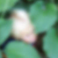
It’s the exact same code as the first example at the top of the page except I changed the transition to one second.
Of course, I changed the photos, too, but you knew that.
I simply used the same photo for both pictures, only I blurred one in a graphics editor.
You can learn how to do graphic edits like blurring and sharpening images, adding text, cropping, creating a watermark, using photo frames and more with our image editing tutorials.
And with that, I’m going to call it a night . . . I’m fading fast.