Nothing is for sale here. Freewill tips keep the site running. Want to help? → Tip via Paypal
Create a Fake Watermark with CSS
One of things I get asked now and then is how to watermark an image without a graphics program.After some playing around I figured out a way to do just that, but bear in mind it’s not a true watermark. If someone saves the image (if they can) there will be no watermark on it. A graphics program is required to place a permanent watermark on an image.
However, this "trick" does make it more difficult to download the image. In some browsers, perhaps most browsers, the image options (copy/save) won't be among the right-click menu options because you're really right-clicking a different division from the one the image is in. Clever, no?
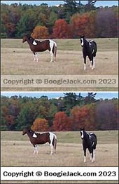
The fact that it looks like it’s watermarked will be enough to discourage many, if not most, people. The example image with the two horses is not watermarked. You can copy the copyright notice and paste it into a text editor. Looks real though!
This trick relies on an opacity filter, but for older browsers that don’t support it, the overlay division will simply have a solid colored background and text. In other words, it breaks down nicely in older browsers. Those would be real old browsers in Internet time, because all the major browsers and most of the others support it now.
In this next image of two screen captures you can see how the watermark looks in browsers that support the opacity filter on the top, and what it looks like in browsers that don't support the opacity filter. Actually I had to cheat on that screen capture. I don't have a browser installed the doesn't support the opacity filter, so I had to set it to be fully opaque.
Setting this up starts with adding some CSS to your external style sheet. Here’s the code for an external style sheet:
{color: #000;
background-color: #fff;
padding: 3px 0px 3px 0px;
opacity: 0.3;}
You could use embedded or inline CSS as well, but then the code “trick” is visible in your source code, rather than forcing someone to track down the code in a separate file. Many won't know how, or will reason it's not worth the effort.
Here’s what each of those lines of code do:
- div.mark
-
Creates a division with the class name of mark. The name “mark” is short for “watermark,” so all you guys out there named Mark, don’t let it go to your head.

- color: #000;
- Sets the font color. Note that the color will be partially transparent, depending on the setting you use. Everything inside the watermark division will be partially transparent—that's the intent.
- background-color: #fff;
- Sets the background color of the watermark division.
- padding: 3px 0px;
- Sets the padding inside the division. I used it to set a cushion of space above and below the line of text (the copyright notice). The first number (3px) sets the padding for the top and bottom, and the second number for the left and right sides.
- opacity: 0.3;
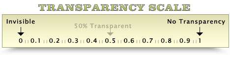
- This is what sets the transparency. You can change the opacity level (how transparent it is) by adjusting the number. The larger the number the less transparency there will be. Perhaps a “visual” will help:
The “trick” to making this work is to nest one division inside another. If we didn’t do it that way the image would be partially transparent as well.
The first division uses the image as the division’s background image. The second division has the opacity setting that includes the copyright text. Here’s the code for the two divisions:
<div style="float: right;
max-width: 240px;
height: 184px;
padding: 0;
margin-left: 10px;
background-image: url('../images/horses.jpg');">

<div style="position: relative;
top: 155px;
font-size: 10px;
font-weight: bold;
text-align: center;
color: #000;
background-color: #fff;
padding: 3px 0px 3px 0px;
opacity: 0.3;">
Copyright © BoogieJack.com 2023
</div></div>
Set the first division to the size of the image you use for the background. Most of the code should be self-explanatory, but there are three items that may need explaining.
- float: right;
- This makes the containing element (the first division) “float” to the right side, which allows text (or other content) to flow alongside it on the left. Change “right” to “left” and the division will be on the left with text flowing around it on the right. Remove that line if you don’t want it to float (text will not flow around the image if you remove the float property).
- margin-left: 17px;
- This places a white space between the image and any other content that “flows” around it. If you change the float property from right to left, then also change the margin-left to margin-right because the “flow” will be on the right side instead.
- position: relative; (and) top: 150px;
- These two pieces of code positions the partially transparent division where we want it. If we didn’t use positioning it would be at the top of the image. By declaring the position relative (to the containing element) we can code this nested division to be 155 pixels from the top. That moves the “watermark” that far below the default position. Change the “155” to a higher or lower number as needed to raise or lower the watermark to where you need for the image you use. All the inline style code in the second division could have been included in the HEAD section with the “mark” class code. I set it up this way in case you have several images of different sizes. That way you can adjust it to them easily instead of having to create a new class for each image.
Use an Image for the Watermark
You can also use an image for a watermark, but for browsers that don't support opacity settings, keep in mind it will cover the image you're trying to display. The number of browsers that don't support opacity these days is likely very miniscule. Frankly, I wouldn't even worry about it, but that's just me.If you don't choose your watermark image carefully, it could look pretty bad. The larger the watermark image, the more of the display image it will hide in browsers that don't support opacity. To use an image for a watermark, insert the image in place of the copyright text I used in the code sample.
Note that if you use an image, or set the "mark" class division so that isn't the full width of the containing division, you can also position the mark class division to the left and right by adding:
…to the mark class division CSS code, just after the top: 150px; property and value. The 50px in my example would move it 50 pixels to the right from the left side of the containing division. Just be sure not to set it too far from the left or it could be positioned outside of the containing division.
That’s the fake watermark trick.
In closing, I ask you to please not read this sentence until next week. Thank you.