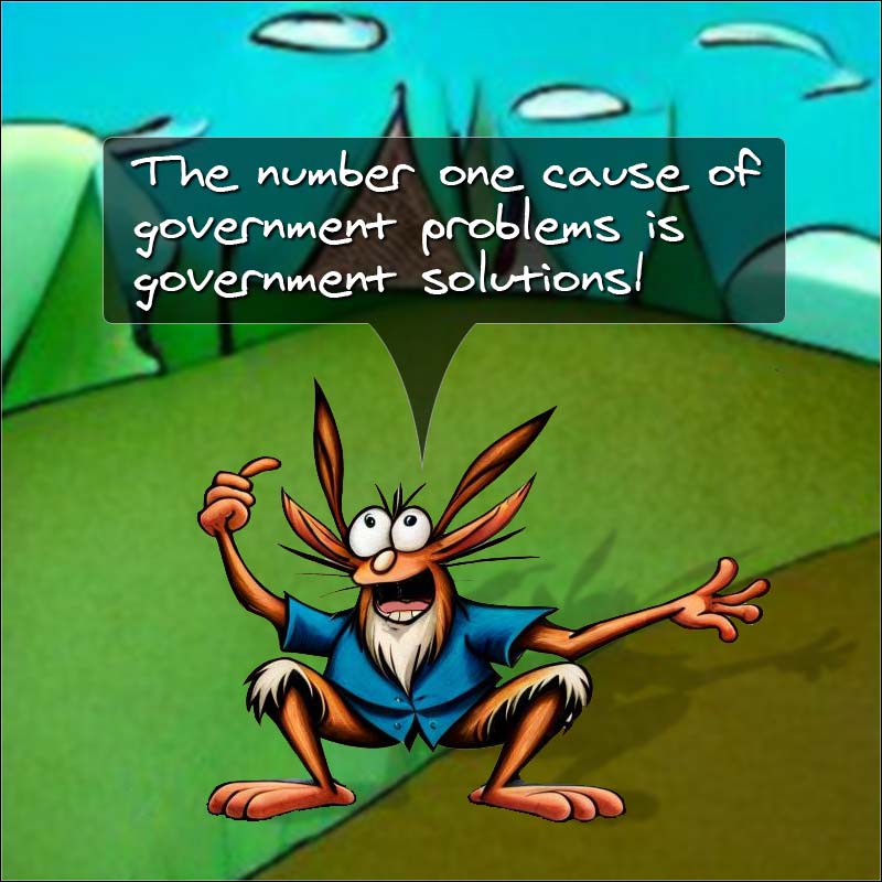
Nothing is for sale here. Freewill tips keep the site running. Want to help? → Tip via Paypal
Cool Corner Ribbon
You may have noticed the red ribbon in the lower right corner of this page before I called attention to it just now. The ribbon can be placed in any corner of your page so it should work with most any design.It’s a real attention-getter. Even if some folks don’t notice it right off, almost everyone will sooner or later if you use a color that stands out from your design. The ribbon can be used for a great many things:
- To announce news about your site, business, or an event.
- To announce a new or updated product.
- To drive traffic to something important.
- To offer a freebie (for joining your mailing list, or just for good will).
- To call attention to a sale.
How to create that ribbon is the subject of this tutorial. Let’s get started…
The HTML is simple:
<a href="YourLink.html">Special Offer!</a>
</div>
It's that simple to add a corner ribbon to your page once you have the CSS set up like you want. You could even create four CSS files, one for each corner of your page so you could post it on whichever corner you want. This example shows a link, but you don't have to use the link, you could use plain text if you wanted.
It’s just an ordinary link inside a division, with a CSS class named “ribbon” added to the division.
Editing this part is easy. Just change the link to point to whatever page you want to send your visitors to, and if needed, change the “Special Offer” text to whatever words you want on the ribbon.
The link text has to be short enough to fit on the ribbon, but if need be, you can adjust the length of the ribbon and the position. This will be explained below.
The CSS is where the “magic” happens. Here’s the CSS code:
.ribbon
  {background-color: #C80B0F;
  overflow: hidden;
  white-space: nowrap;
  position: fixed;
  right: -40px;
  bottom: 20px;
  z-index:999999;

  -webkit-transform: rotate(-35deg);
  -moz-transform: rotate(-35deg);
  -ms-transform: rotate(-35deg);
  -o-transform: rotate(-35deg);
  transform: rotate(-35deg);

  -webkit-box-shadow: 0 0 9px #999;
  -moz-box-shadow: 0 0 9px #999;
  box-shadow: 0 0 9px #999;}

.ribbon a
  {border: 2px solid #FEDB63;
  color: #fff;
  display: block;
  font-family: Verdana, Helvetica, Arial, sans-serif;
  font-size: 12px;
  font-weight: bold;
  font-variant: small-caps;
  margin: 1px 0;
  padding: 10px 50px;
  text-align: center;
  text-decoration: none;
  text-shadow: 0 0 5px #444;}
It's probably easier than it looks, so here's what all that means...
Line 1 creates a CSS "ribbon" class name. The name of the class is arbitrary, but I like to use naming conventions that are relevant, and since this part of the code sets the properties for the ribbon, that’s what I called it.
I’m clever that way.

Line 2 sets the background color of the ribbon.
Line 3 hides the excess ribbon, which is necessary to have so it looks like the ribbon wraps around the corner of the page.
Line 4 prevents the text from automatically wrapping to the next line. Use a
tag if/where you want the text to wrap to a second line. You may have to make the ribbon wider or the font smaller to do that. It’s best not to be too wordy though.
Line 5 sets the position to fixed. That way the ribbon will always be visible, it won’t scroll with the page.
Lines 6 and 7 set the actual position of the ribbon. You may need to adjust one or both of these lines, depending on the text you use on the ribbon. Just play with one number at a time and you’ll quickly make the needed adjustments. To position the ribbon on the left side of the page change right to left in line 6. To position the ribbon at the top of the page change bottom to top in line 7.
Lines 8 sets the z-index to a high enough number that the ribbon is on top of all other content.
Line 9 is intentionally blank to separate the code into related chunks. You do not have to leave the blank lines in your code.
Lines 10 through 14 rotate the banner at a -35 degree angle. Notice the minus sign in front of the number. If you move the ribbon to the top of the page remove the minus sign to have the ribbon tilt correctly in that position. If you move the ribbon to the other side of the page, numbers are just the opposite: Use the negative rotation for a ribbon at the top of the page and the positive position for a ribbon at the bottom of the page.
Note: Most ribbons like this are at a 45 degree angle, but I think 35 degrees gets attention just as well and is easier to read. Of course, feel free to change it and play around with different angles. Doing so may require you to adjust the position and the padding.
Also, line 13 is the official CSS property. Modern browsers will use that line and ignore lines 9 through 12 (as long as it comes after the other four lines, which are there for older browsers that aren’t CSS3 compliant).
Line 15 is intentionally blank.
Lines 16 through 18 set the drop shadow for the ribbon. Line 18 is the official CSS code. Lines 16 and 17 are there for older browsers. You can learn how the shadow works in this CSS Text Shadow tutorial. The tutorial is about text shadows, but it's the same thing.
Ribbon is Set, Now the Link
That’s it for the ribbon code. Lines 20 through 32 are for the link. Let’s take break that down, too.Line 19 is intentionally blank.
Line 20 is the .ribbon class again, but sets a conditional "a" (anchor) element. That means any link within the "ribbon" class will follow this set of rules but other links on the page wont' be affected.
Line 21 creates the yellow border.
Line 22 sets the color of the link text.
Line 23 sets the display to “block” rather than the default of inline. This basically keeps the ribbon from collapsing around the text.
Lines 24 through 27 set various font properties. You could set those properties all in one declaration if you like. I originally set it up that way, but then thought it would be easier for less experienced coders to edit this way.
Line 28 adds a one pixel margin on the top and bottom. This is what creates the red edge on the outside of the yellow lines. The side margins are set to zero.
Line 29 sets the padding (top and bottom of 10 pixels, 50 pixels on the sides). The padding creates the space around the text for balance. It also forces the ribbon to be longer than the text, but if you make any drastic changes you may have to add a width to the first chunk of code (after the background color, for example).
Line 30 centers the text.
Line 31 removes the underline from the link.
Line 32 creates a text shadow.