Nothing is for sale here. Freewill tips keep the site running. Want to help? → Tip via Paypal
Color Theory
Color theory is a field of study that explores how colors interact with each other and how they can be used effectively in various art forms, design, and aesthetics. It also includes the emotional and psychological impact different colors have on humans.There have been many books written about color theory. Obviously this page cannot be an in-depth treatment of the topic. It is only a very light overview with a thought or two of my own included. Hopefully that will tell you if it's a topic you want to explore in more depth.
Many art and design instructors will tell you it's wrong to choose colors just because you like them, but I disagree. To my way of thinking, color always has meaning. Even if the meaning is no more than your personal opinion, why should that have any less value than their opinion? After all, color theory is both subjective and culturally influenced. Different cultures and individuals may interpret colors differently, and personal preferences can also play a role in expert opinion whether they admit it or not.
Having said that, when choosing a color scheme you do want to be sure it does not conflict with the purpose of the web site you’re designing. Few people would advise using black and fiery red for the main colors of site intended for young children. Most would deem that a dark and angry scheme, inappropriate for the target audience.
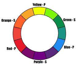 The image is the basic color wheel. The yellow, blue, and red colors are primary colors. By mixing equal parts of red and yellow we get orange, which is a secondary color. Yellow and blue make green, another secondary color; and blue and red make purple, the third secondary color. Third secondary . . . hmm.
The colors in between the primary and secondary colors are called tertiary colors. The tertiary colors are made by mixing one primary color and one secondary color in equal parts. They are red-violet, blue-violet, blue-green, yellow-green, yellow-orange, and red-orange.
Some definitions of tertiary colors expand that to include the mixture of two secondary colors, and others say tertiary colors are all the millions of colors not named as primary or secondary colors. Whatever you believe about tertiary colors, to me, that’s where the fun is at. Man cannot live on primary and secondary colors alone!
If musical harmony can be described as a mixture of tones that are pleasing to the ears, then color harmony might be described as a mixture of colors that are pleasing to the eyes. Some people have an instinct for which colors go together, others prefer to rely on various color models. I prefer to trust my eyes.
For those who prefer to place their trust in a color model, listed below are the three most well known and often used color schemes.
Analogous Color Scheme
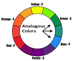 Analogous colors are any three colors side-by-side on the color wheel, such as green, blue-green, and blue. This image shows an example of analogous colors.
Analogous colors usually match fairly well, but they often offer less contrast than other color schemes.
Analogous colors are often good for creating color schemes where you want viewers to feel comfortable. Analogous colors from the blue/green/purple side of the wheel are especially appropriate for that.
Here are three positive and three negative aspects to using an analogous color scheme.
Positive
- Harmonious and Cohesive: Analogous color schemes create a sense of harmony and visual unity. Since the colors are adjacent on the color wheel, they naturally blend well together, providing a cohesive and balanced appearance to the website.
- Subtle Contrast: Analogous color schemes offer a softer and more subtle contrast compared to other color combinations. This can be advantageous when you want to create a calming or soothing visual experience. It can work well for websites that aim to convey a sense of tranquility or elegance.
- Easy on the Eyes: Analogous color schemes tend to be visually pleasing and easy on the eyes. The colors are usually in a similar range, making them less jarring or overwhelming for the viewer. This can result in a comfortable browsing experience, especially for websites with a lot of content or longer reading sessions.
Negative
- Lack of Visual Interest: Analogous color schemes, while harmonious, can sometimes lack visual interest or excitement. The limited color variation may make the website appear monotonous or dull, especially if not combined with other elements such as texture, pattern, or contrast.
- Limited Differentiation: Analogous colors can be similar in hue and intensity, which may lead to a lack of differentiation between different elements on the website. This can make it challenging to establish a clear visual hierarchy or distinguish important information, potentially affecting usability and user experience.
- Accessibility Concerns: Accessibility is a critical consideration for websites. Analogous color schemes may present challenges for individuals with color vision deficiencies (color blindness) as the colors can be more difficult to distinguish. It's essential to ensure sufficient contrast and consider accessibility guidelines when using analogous colors.
Complementary Color Scheme
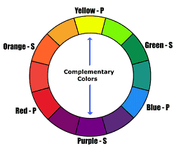 Complementary colors are those directly across from each other on the color wheel. Don't let the name fool you though, complementary colors often don't "compliment" each other very well.
They do offer high contrast and vibrancy, so they work best when you really want to make something stand out. Many businesses use complementary colors in their logos and sales flyers. This image shows a sample of complementary colors.
There is also the split-complementary color scheme and double complementary scheme. With the split complementary scheme you pick one color, let's say red for example, and then across the color wheel you'd use the two colors beside the complementary color, yellow-green and blue-green in this example. The double complementary scheme uses the colors on either side of both pairs of complementary colors.
Here are three positive and three negative aspects of using a complementary color scheme.
Positive
- Vibrant and High Contrast: Complementary colors are located opposite each other on the color wheel, creating a strong visual contrast. This high contrast can be attention-grabbing and dynamic, making the website visually engaging and energetic. It can be particularly effective when you want to draw attention to specific elements or create a sense of excitement.
- Enhanced Visual Hierarchy: Complementary colors provide a clear distinction between different elements on the website. By using complementary colors for foreground and background elements or important calls-to-action, you can establish a strong visual hierarchy. This helps guide the viewer's attention and ensures key information stands out.
- Dynamic Color Harmony: Complementary color schemes offer a balanced harmony by combining warm and cool colors. This combination can create a visually striking and well-balanced composition. When used effectively, complementary colors can evoke a sense of visual interest, depth, and sophistication.
Negative
- Potential Visual Overload: Complementary colors can be highly contrasting, which, if not used thoughtfully, can lead to visual overload or a busy appearance. When complementary colors are used in large quantities or at full intensity, they can create a visually overwhelming experience and make it difficult for users to focus or read content comfortably.
- Risk of Clashing and Disharmony: While complementary colors can create a vibrant contrast, it's important to choose complementary pairs carefully. Some complementary combinations can clash or create an undesirable visual effect. For instance, certain combinations of bright red and green can evoke a Christmas-like appearance, which is going to have limited appeal in many contexts.
- Accessibility Challenges: Complementary color schemes can also pose challenges for individuals with color vision deficiencies. Depending on the specific colors chosen, people with certain types of color blindness may have difficulty distinguishing between complementary colors. It's crucial to ensure sufficient contrast and consider accessibility guidelines to make the website inclusive for all users.
Triadic Color Scheme
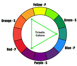 The triadic color scheme uses three colors spaced equally apart around the color wheel. This scheme offers strong visual contrast while retaining harmony and color richness. This image shows an example of triadic colors.
Personally, I'm one of those rebels that doesn't use any particular color scheme—I just choose colors that look good together to me.
After all, my designs are a reflection of my creativity and taste, why should I limit myself to such a small palette of colors by using some color wheel scheme?
Here are three positive and three negative aspects of using a triadic color scheme.
Positive
- Vibrant and Balanced: A triadic color scheme consists of three colors equally spaced around the color wheel. This creates a harmonious balance of colors that can be visually striking and vibrant. The use of three distinct colors adds energy and interest to the website's design, making it visually appealing and dynamic.
- Versatile and Diverse: Triadic color schemes offer a wide range of color combinations, allowing for versatility in design. With three colors that are evenly distributed, there are multiple ways to create harmonious compositions. This versatility gives designers more options for creating visual interest, establishing focal points, or conveying specific moods or themes.
- Enhanced Contrast and Hierarchy: Triadic color schemes inherently provide a strong visual contrast between the three colors. This contrast can help establish a clear visual hierarchy by assigning different roles to each color. For example, one color can be used for headlines, another for background elements, and the third for accents or calls-to-action. This creates a visually organized and engaging experience.
Negative
- Potential for Clashing Colors: While a triadic color scheme can offer versatility, it also carries the risk of colors clashing if not chosen carefully. With three distinct colors, it's important to ensure they complement each other and work harmoniously. Poorly chosen triadic color combinations may create a chaotic or overwhelming visual effect that can be off-putting for users.
- Complexity in Color Harmony: Creating a harmonious balance among three colors can be more challenging than with other color schemes. It requires careful consideration of the saturation, value, and placement of each color to avoid visual overload or imbalance. Achieving a cohesive and visually pleasing result may require more experimentation and skillful color composition.
- Potential for Color Dominance: In a triadic color scheme, if one color dominates the design too strongly, it may overpower the other colors and disrupt the overall visual balance. It's important to ensure that the three colors have similar visual weight and share the attention evenly. Balancing the dominance of each color is crucial for maintaining a harmonious and cohesive design.
Whether you use color theory or simply choose colors you like, the goal is the same. As web designers we want to create aesthetically pleasing websites. When we achieve color harmony and balance it silently engages the viewer and helps create an inner sense of order.
When our designs are not harmonious they can be visually unappealing, or even seem disturbing or chaotic, potentially causing a sense of disorder and aversion.
Color has many emotional and psychological associations. Much of the “feeling” a viewer will get from the colors you choose for your web designs depends on these factors:
- Harmony or lack of harmony in the total color scheme.
- The shades or hues of the color.
- The message the graphics convey.
- The “tone” of your written voice.
- The actual message your words convey.
I think the last two items are primal. Color theorists might disagree, but wordsmiths will likely be in complete agreement. In the chart below you’ll find a multitude of emotional responses the primary and secondary colors can elicit, as well as black and white. Do keep in mind that there are many other factors that "color" the perception of color.
| Red | |
|---|---|
| Keywords | Triumph, intensity, impulsiveness, action, warmth, hot, fiery, energetic, passionate, emotional, love, valentines, stop, danger, war, alarm, warning, violence, blood, malice, competitive, stimulating, daring, aggressive, empowering, exciting, zest, erotic, arousing, awareness, saucy, spicy. |
| Comment | Emotionally intense, red stimulates and gets noticed. |
| Yellow | |
|---|---|
| Keywords | Joy, happiness, optimism, idealism, sunshine, cheerful, energy, revitalization, gold, summer, cowardice, jealousy, deceit, illness, hazard, elation, brightness. |
| Comment | Yellow can be a very difficult color for the eye and can be overpowering if overused. |
| Blue | |
|---|---|
| Keywords | Tranquil, serene, peaceful, relaxing, cool, cold, confident, vulnerable, soft, passive, responsible, sophistication, richness, sky, ocean, harmony, trust, truth, confidence, water, spaciousness, comfort, sorrow, loyalty, calming, unity, stability, security. |
| Comment | Blue is the number one color for businesses because of the trust factor. |
| Green | |
|---|---|
| Keywords | Growth, stability, balance, nature, generosity, kindness, approval, permission, health, good luck, renewal, youth, vigor, spring, fertility, jealousy, inexperience, envy, calm, conservative, masculine. |
| Comment | Green is easy on the eyes and is often used in hospitals because it relaxes patients. |
| Orange | |
|---|---|
| Keywords | Warmth, heat, energy, summer, friendliness, youth, happy, motivated, cheerful, tart, tangy, tasty, health, appetite, strength, endurance, tropical, enthusiasm, creativity, determination, attraction, encouragement, stimulation, citrus, passion, pleasure. |
| Comment | Orange is the excitement and energy of red with the happiness of yellow. |
| Purple | |
|---|---|
| Keywords | Royalty, noble intent, spirituality, ceremony, mystery, transformation, wisdom, enlightenment, cruelty, arrogance, exotic, moodiness, romance, luxury, wealth, sophistication, protection, comfort, security. |
| Comment | Because purple is rare in nature, care must be taken so as not to appear artificial. |
| Black | |
|---|---|
| Keywords | Power, weight, formality, elegance, mystery, fear, evil, anonymity, depression, depth, high style, remorse, anger, mourning, death, authority, timeless, submission, aloofness. |
| Comment | Black text on a white background provides the best contrast for reading. |
| White | |
|---|---|
| Keywords | Balance, reverence, purity, simplicity, cleanliness, peace, Godliness, innocence, youth, winter, snow, cold, goodness, humility, sterility, marriage, neutrality, illness, safety. |
| Comment | White is often associated with light, love, goodness and purity. Considered the color of perfection and holiness. |
Many of the keywords for any one color in the previous chart may seem contradictory. The fact is, just as we all experience many different emotions, any individual color can evoke a variety of emotional responses. The direction it goes usually depends on the tone of the other factors involved.
If you'd like to know more about color theory, here are some keywords and keyword phrases to search—you'll find a full palette of information.